As a Brit, I was bemused when Kass said “let’s go to Liverpool” and I ended up in a department store.
Indeed, México’s biggest chain of retail mazes is named ‘Liverpool’.
There are about four or five in Monterrey, from memory, each figureheading a different mall. They sell everything. Clothes, books, electronics, furniture, flights, booze, jewellery, snacks, insurance, etc.
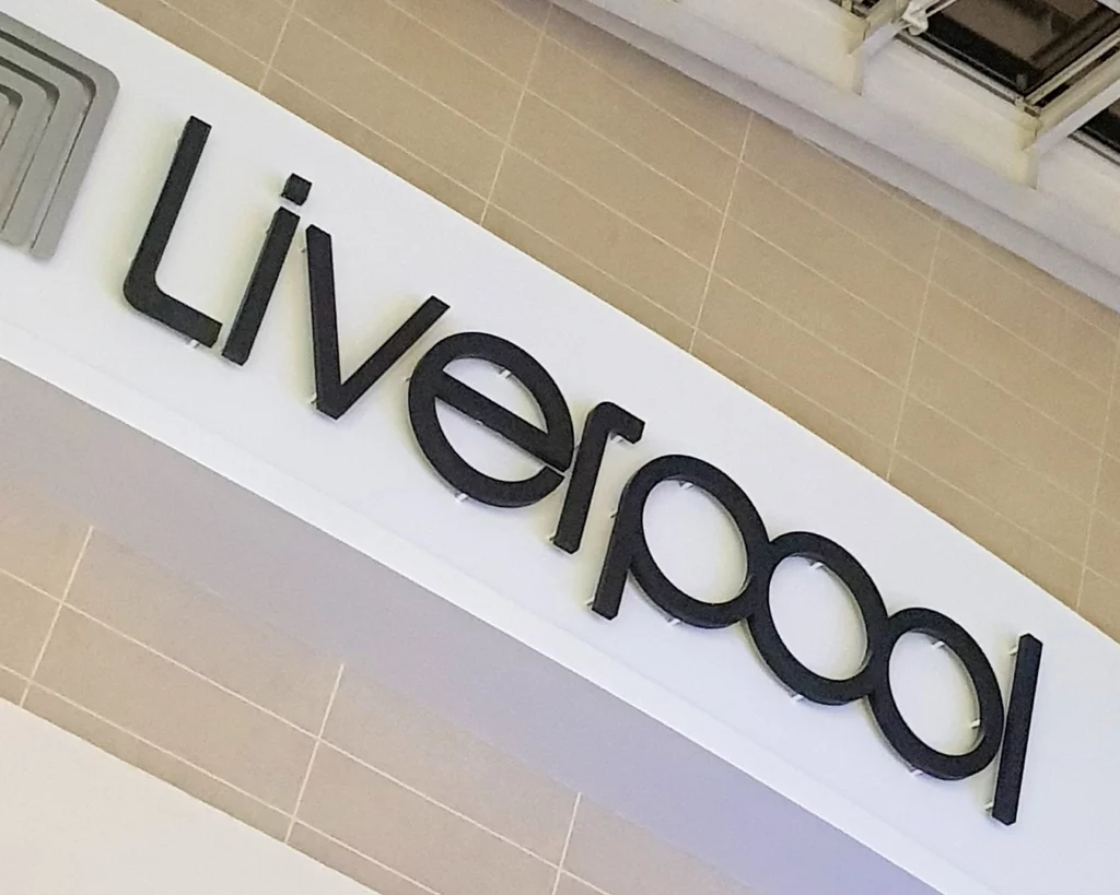
Being a lover of design, the first thing that caught my eye was the Liverpool logo. Specifically, three letters in the logo.

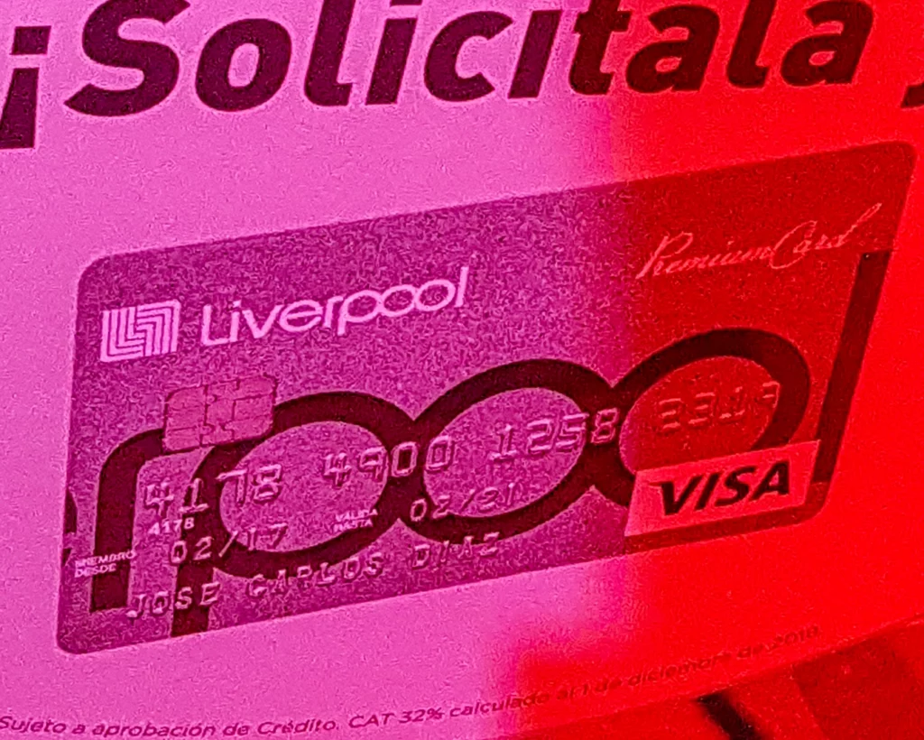
Do ya see it? Here’s an ad for their credit card:

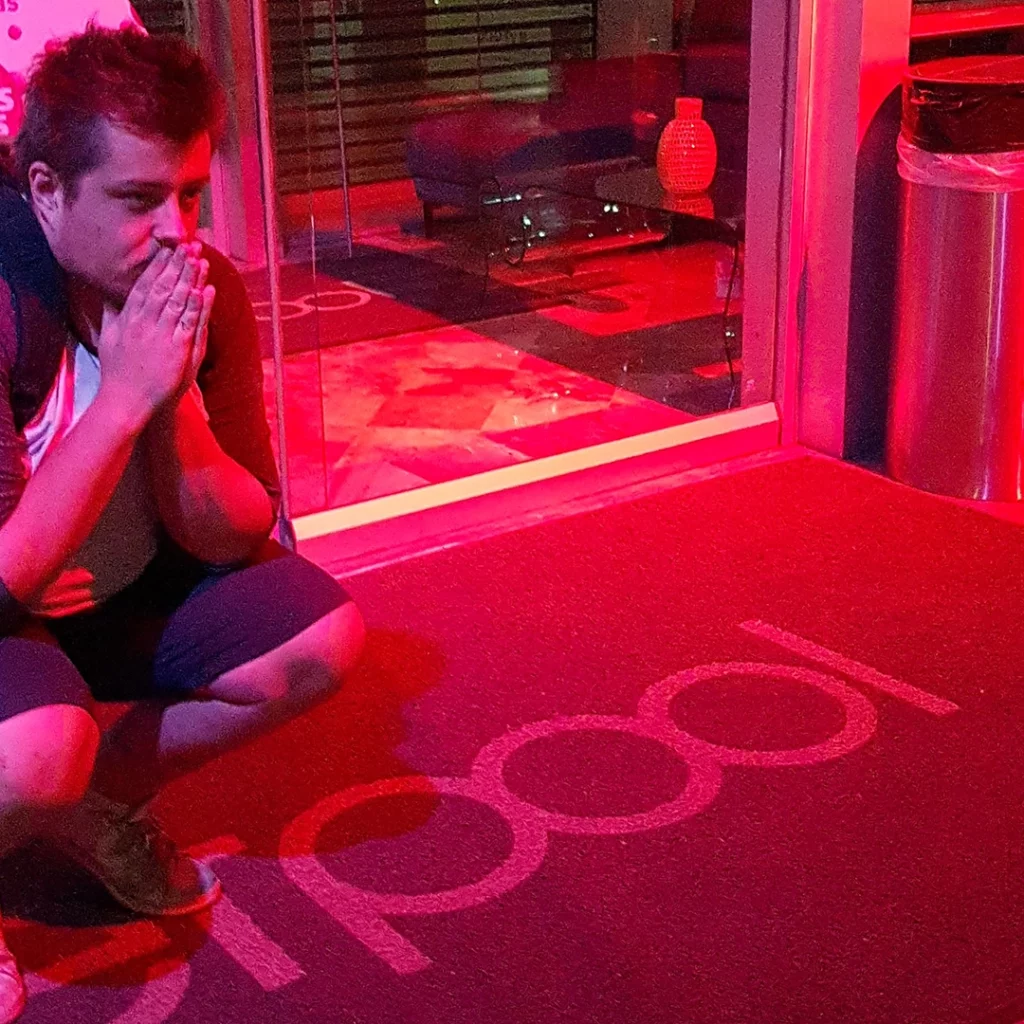
See it yet? Here’s me squatting on the welcome mat after closing time:

In typography, a ‘ligature’ is what you get when you fuse two letters into a single glyph, like ‘ae’ becoming ‘æ’ in ‘encyclopædia’ (if you’re so inclined to sprinkle a bit of zhuzh amid your graphemes).
‘Poo’. The three conjoined letters in the Liverpool logo spell out ‘poo’.
Nobody I’ve ever pointed it out to had already noticed it, which I suppose is understandable if we’re talking about just the logo, but, I mean, just look at that photo of the credit card. ‘POO’ couldn’t be more blatantly framed.
I have no idea if this is intentional; whether some disgruntled designer a few decades ago invented ‘trolling via ligature’ and then had kids who carried on their legacy by highlighting the glorious fæcal glyph in the crop of the credit card layout.
No matter — it’s there anyhow. A big pink poo on every mall in México.