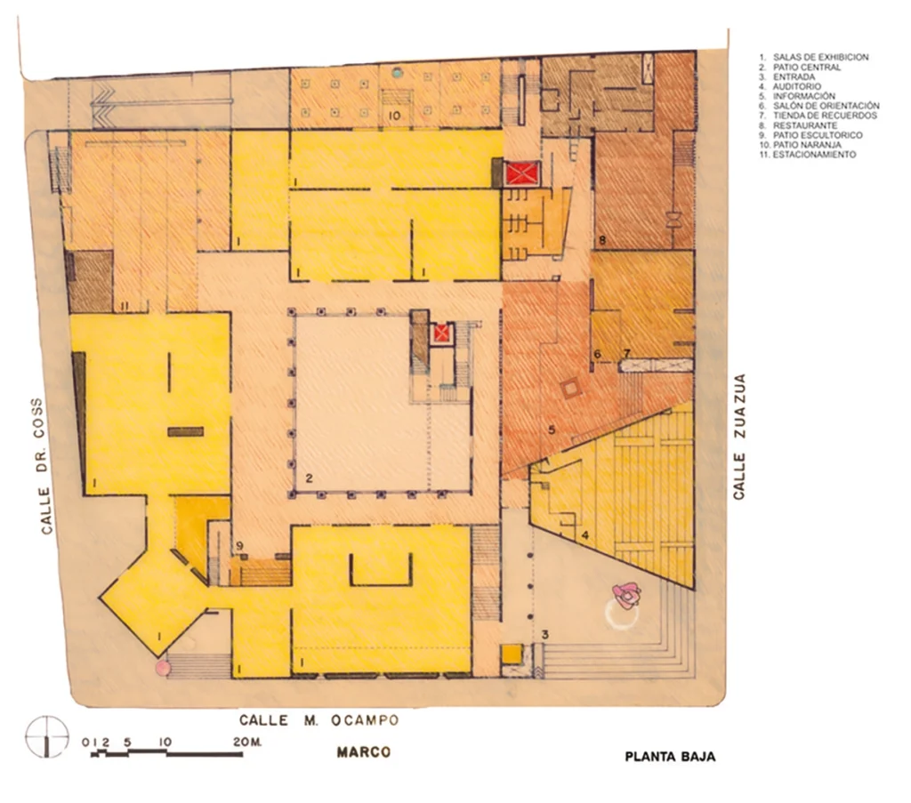
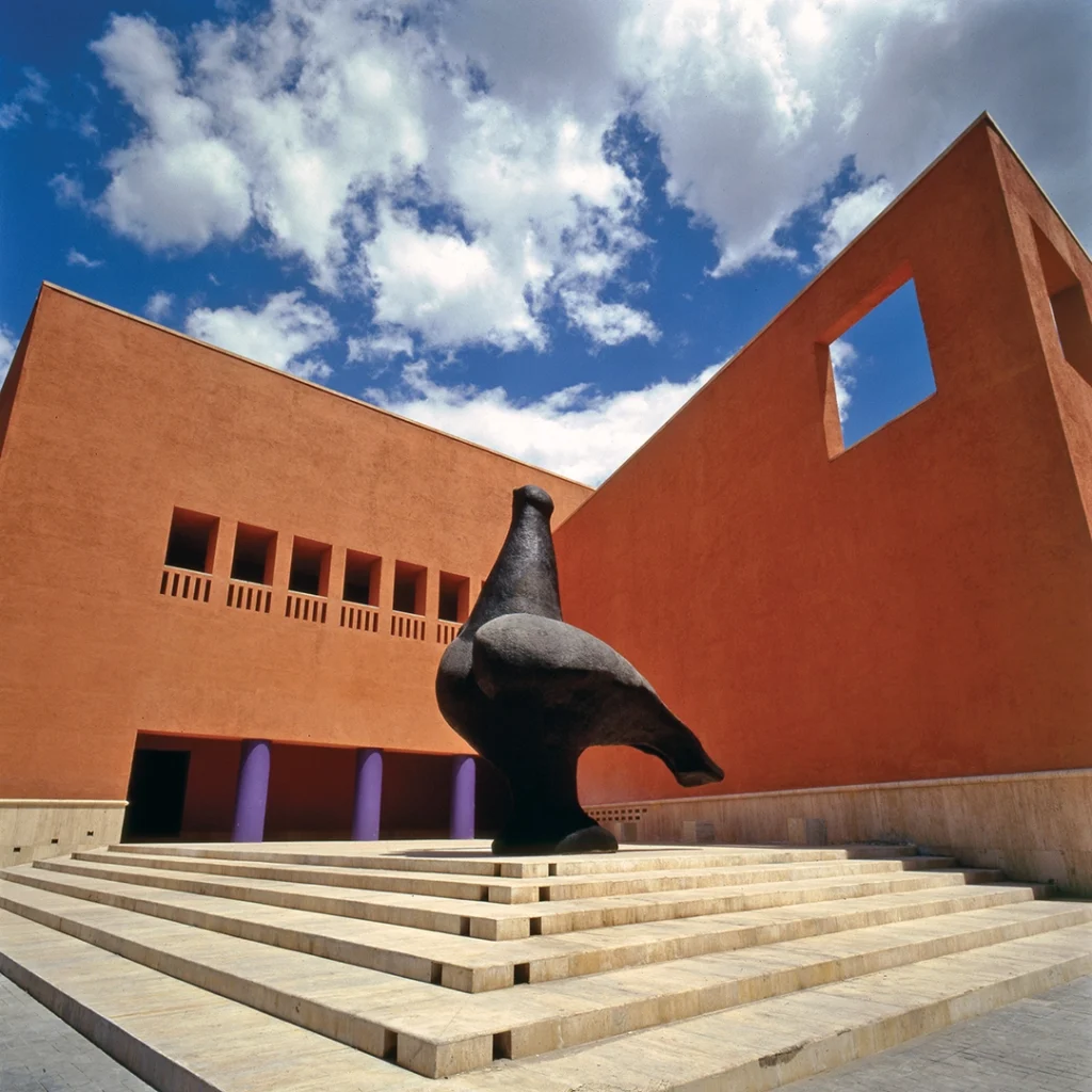
One of the first places Kass took me in Monterrey is also, to this day, one of my favourite places in the city: MARCO — Museo de Arte Contemporáneo (Museum of Contemporary Art).
It ticks all my boxes: there’s a giant bird sculpture outside; the selection of books in the shop is one of the best I’ve ever seen in a museum; and, of course, the curation is always fantastic.
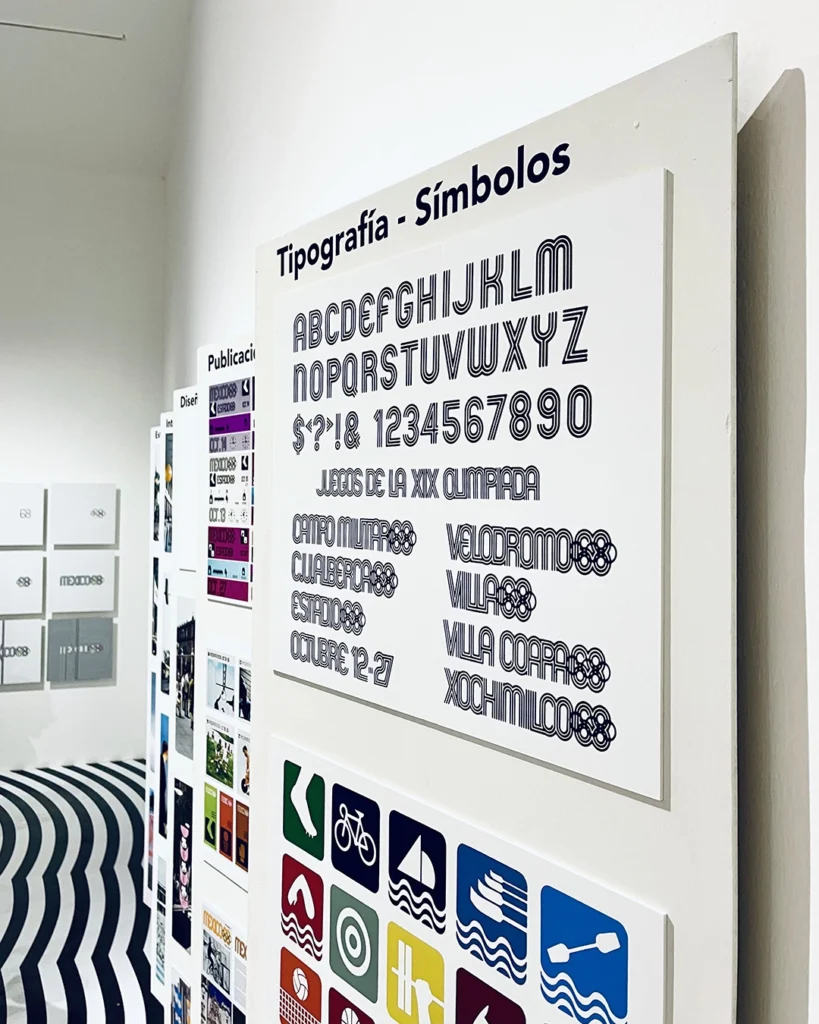
An exhibition we saw mid-2024 featured a small nod to one of my favourite branding projects of all time: the México ‘68 Olympics. I’d first learned of the project nearly a decade prior in TASCHEN’S ‘LOGO MODERNISM’, an enormous orange tome showcasing thousands of logos and identity systems.
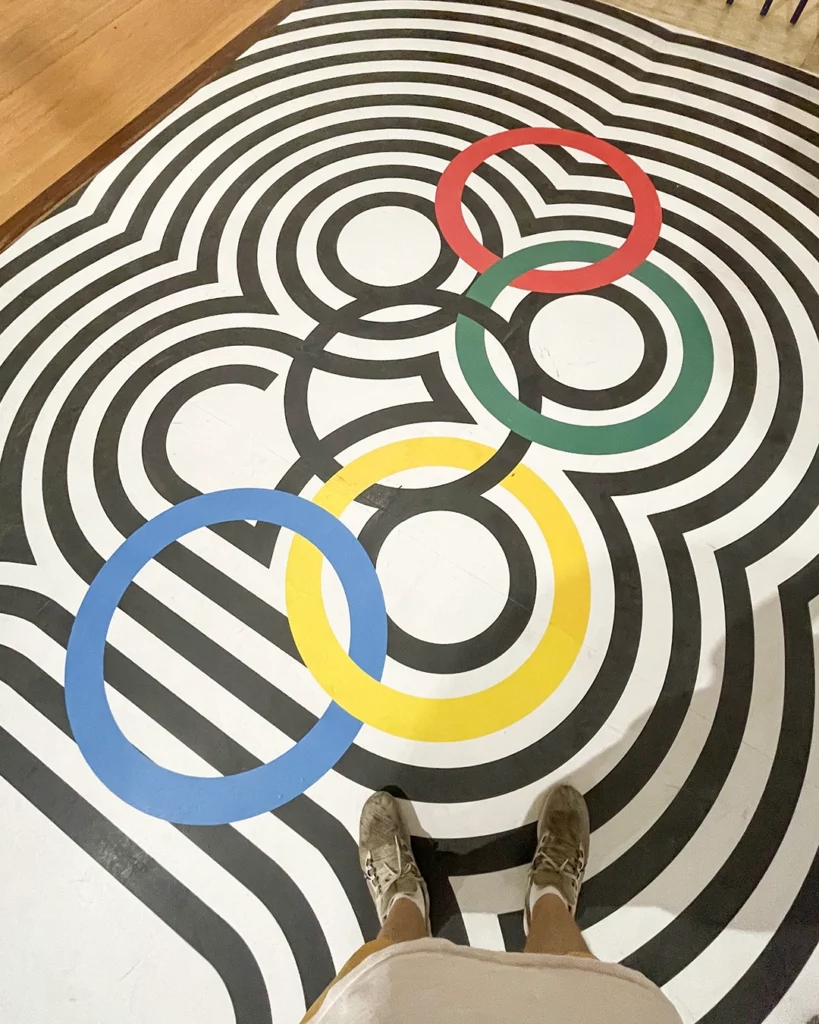
(One of the three lead designers of the México ‘68 graphics, Lance Wyman, also standardised the visual identity of México City’s metro network, so I got pretty hyped when we planned my second trip to México around a visit to CDMX.)
When we first visit MARCO in early 2018, Kass teaches me about ‘rosa mexicano’ — Mexican pink — a fuchsia-ish tone that’s been adopted as a chromatic element of Mexican identity through art, fashion, and architecture over the past century. (The hex code is E4007C, if you want to use it in something digital).
One of the walls in the museum courtyard is painted rosa mexicano. Perfect selfie spot.

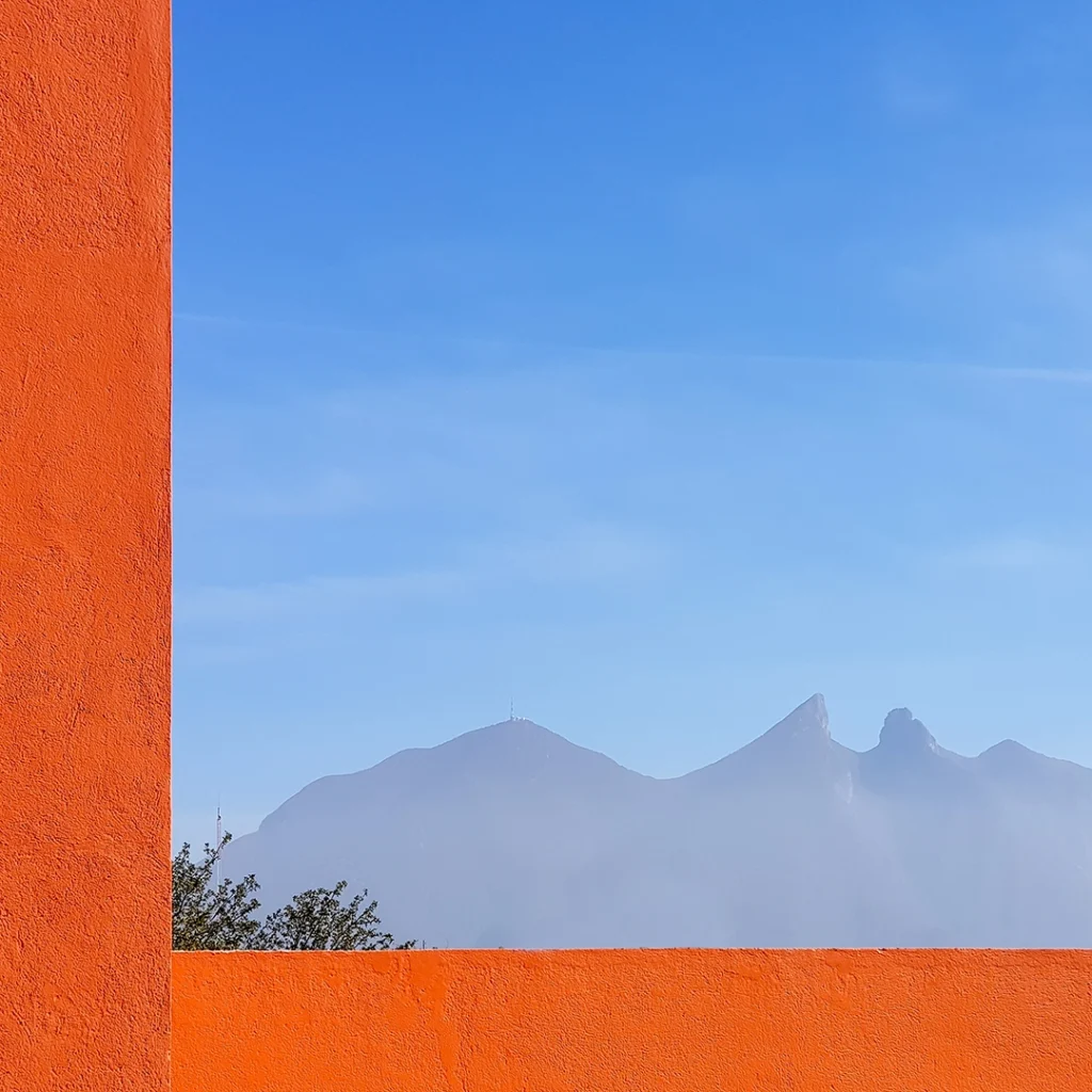
Another wall is painted a bold orange that’s a touch more vibrant than the terracotta colour of most of MARCO’s exterior. Its squareness frames the Cerro de la Silla mountain perfectly.
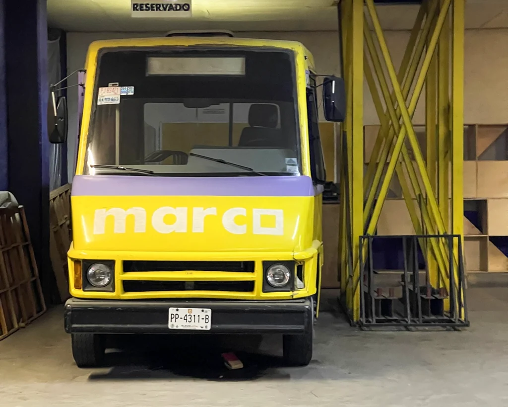
Just as the México ‘68 identity was extrapolated across every visual element of the Olympics (from enormous architectural motifs to dress fabric patterns), MARCO’s brand mark — mainly the thick square that forms the ‘O’ — is threaded into the DNA of the museum to a thrillingly obsessive degree. You can see it on the front of the adorable bus in this photo:
Before you even step inside, the walls to the right of the entrance have two large squares cut through, and, though I might be going mad here, I’m almost certain the space around the cut-throughs are equal to the width of the ‘O’ in the ‘MARCO’ logo, but scaled up. The wall to the left of the entrance has several smaller square cut-throughs. Pillars in the entryway are spaced apart just right to create square apertures. Most of the windows around the building are square. The ad banners hung outside? Square.
Even the signposting is square. This, in particular, caught my eye, because it reminded me of the hoops used in the millennia-old Mesoamerican ballgame ‘pok-ta-pok’.
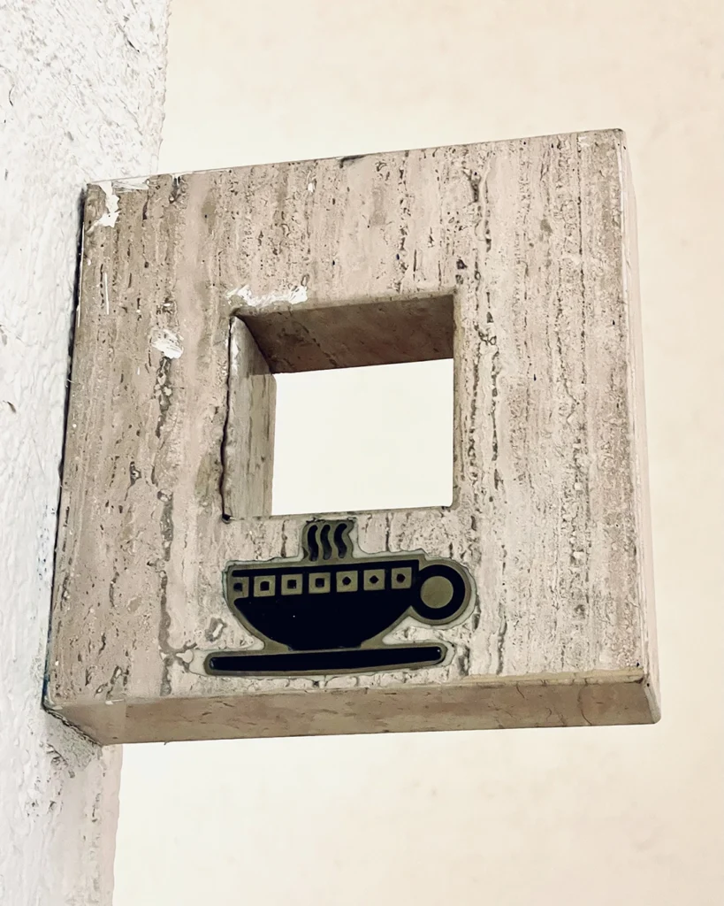
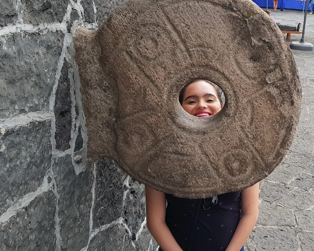
(First photo: the square signpost in MARCO. Second photo: Kass on a pok-ta-pok court in CDMX. Up to this point, the photos in this entry have been mine. The rest below, I found online.)
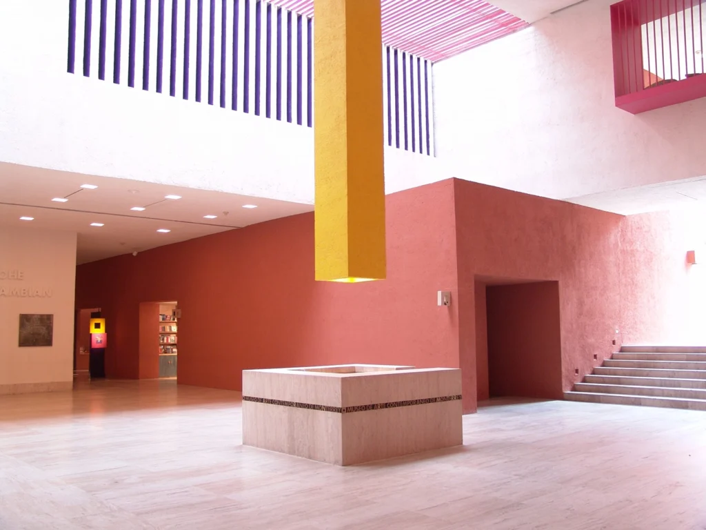
The information/help desk? Square. The pillar hanging from the high ceiling above the information desk, which houses lighting? Square. Most of the archways leading from one space to the next? Square. The mezzanine windows looking from the upper level to the lower level? Square. The entire central hall connecting everything together? Square. It’s really quite re-marco-ble (sorry).
So, the exhibitions are great, the bookstore is brilliant, and the museum’s brand identity is tightly woven into its architectural fabric. How could it get any better than that?
Well…
It’s June 2024. Torrential rain has forced us to shy away in the back of a coffeeshop around the corner from the museum. The friend we’re going with is on her way to pick us up and drive us the rest of the way (we hadn’t dressed in preparation for this kind of downpour).
While we’re waiting, Kass and I start talking about a relative who’s building a piece of furniture for her (they’re a dab hand at carpentry). I mention I also need to ask them about some frames I want made for a few band posters. Then, always keen to fill gaps in my vocabulary, I ask: “What’s ‘frame’ in Spanish?”
Kass says: “Marco.”
I disassociate for a moment. My spirit snaps out of my body and transcends to a white void where millions of tiny glowing dots stretch out as far as the eye can see. I float around for a while until I find myself in a spot where, from my perspective, all these millions of glowing dots align, revealing a miracle that was always there, but not yet visible to me. Then I collapse back into my body.
“Why’d you think the museum was called that, dumbass?”
I tell Kass: I thought it was just an acronym for Museo de Arte Contemporáneo, but now I know there’s a second meaning; MARCO houses thousands of framed artworks and is, in itself, a frame for the stories those artworks tell.
Our friend arrives. I don’t remember getting in their car and driving to the museum. All I know now is squares. The world is square. Everything is square.
As we’re queuing for tickets, I look up at the squares cut through the outside walls. It was already pretty cool to think of it as a nod to the museum logo, but now I’m also looking at it as a frame, and, if you allow yourself to get a bit romantic about things, it’s almost like it’s framing the sky. Sort of how I used the walls to frame the Cerro de la Silla in my photo six years prior.
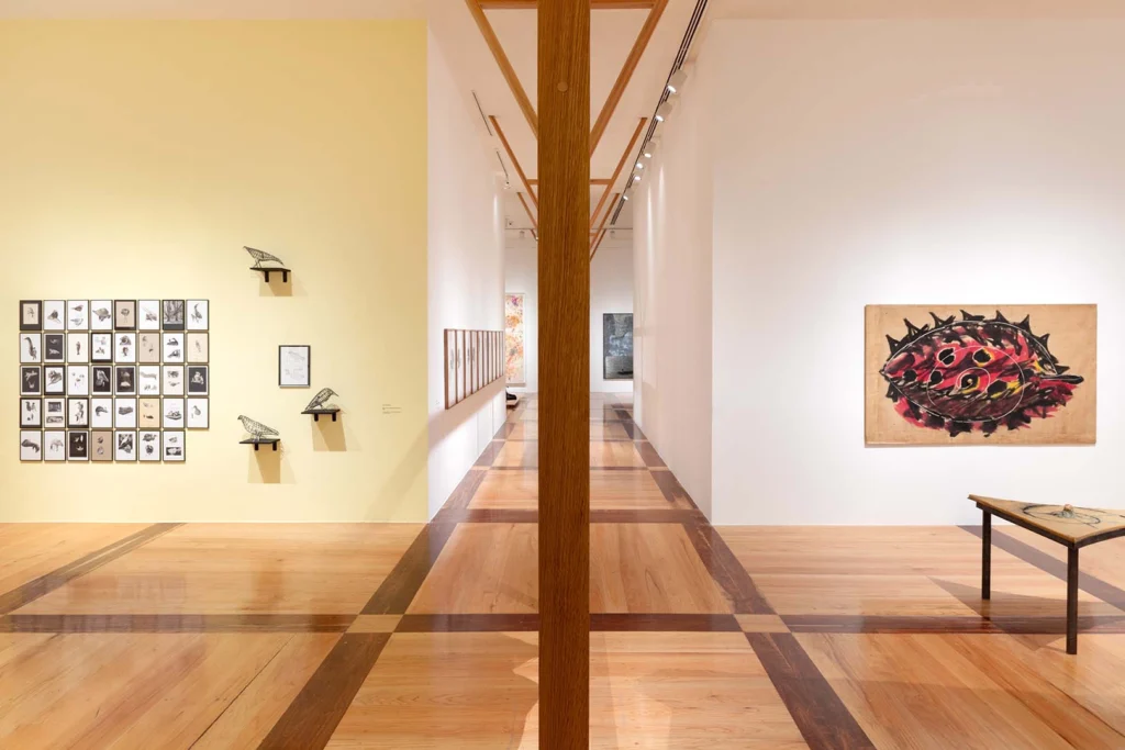
Now, as we’re walking around the museum, I’m reassessing all the squares as frames. There are the obvious ones: the square entry archways could be said to be frames for the exhibitions they lead you to. But then there are some longer square hallways where the artwork at the other end seems almost purposely placed to play with perspective and make the passages feel like immersive frames you’re stepping into.
I’m truly gobsmacked when I glance at the floor and notice there’s a square wood panelling motif running throughout much of the museum. So it’s not just the artworks on the walls which are framed, in the ‘traditional’ sense — the sculptures, statues, and other such works that are positioned in the middle of exhibition spaces have their own form of framing, too.
Some of this might be intentional. Some of it might just be me finding delight in things that aren’t there. Either way, there’s a captivating trinity of identity, language, and narrative here: the acronym ‘MARCO’, its meaning in Spanish, and the many lives of its square ‘O’.
Austrian artist and architect Friedensreich Hundertwasser is famous for saying: “Straight lines are godless lines.” Hundertwasser obviously never had the chance to visit MARCO.
